Dos and don’ts on designing for accessibility
Karwai Pun, GOV.UK:
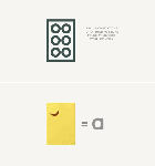
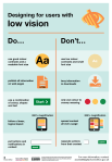
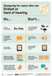
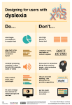
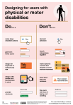
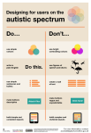
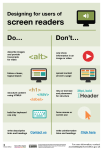
The dos and don’ts of designing for accessibility are general guidelines, best design practices for making services accessible in government. Currently, there are six different posters in the series that cater to users from these areas: low vision, D/deaf and hard of hearing, dyslexia, motor disabilities, users on the autistic spectrum and users of screen readers.
[…] Another aim of the posters is that they’re meant to be general guidance as opposed to being overly prescriptive. Using bright contrast was advised for some (such as those with low vision) although some users on the autistic spectrum would prefer differently. Where advice seems contradictory, it’s always worth testing your designs with users to find the right balance, making compromises that best suit the users’ needs.
[github]
I’ve been wanting something like this to reference! Boosting for the others that like to dabble in code/design.
This is some of the most lucidly written accessibility advice I’ve seen. Making accessible web pages should be the default, not an add-on. It’s really not that hard to do, especially when you think about it from the start – and it benefits everyone.
(Obligatory note that there are exceptions to some of these guidelines, e.g., “bunching” some interactions together is an important way to cue which interactions are related to each other, but that’s why these are guidelines, not absolute rules.)
young web designer: thank you oh my god no one has been able to explain this quite as well and this is just good shit
Tag: visually impaired
This is remarkably good, sharp and both funny, sad, righteous-angering and, well, eye-opening. It’s for the blind and partially-sighted, and just as much it’s for those of us who have never had to think about any of this stuff, and is called “10 Steps to Help You Find the Perfect Job”.
Watch: Braille Bricks could help teach blind and sighted kids literacy — but they need everyone’s help.
Follow @the-future-now
What a fucking brilliant idea. Boost the fuck outta this!
WHERE IS THE KICKSTARTER?
This is so awesome like holy geeze. I’ve got tools and a lot of time. If anyone wants me to make one of these, get me the legos and I’ll make it for you. I’ll even engrave the tops so that people who CAN see can read it too. All you’d have to do is tilt the board.
Bonuses: easy to edit. And at the end of the day? You can still play with them like regular legos. It would be a fun challenge to build around the braille bricks too, because their shape is altered.

Help for web browsing with colour blindness.
Chrome has a new extension called Color Enhancer
It is fairly simple to use and can help you change the images on your screen to improve contrast or make them of colours that you can see more easily if you are partially colour blind.
“A customizable color filter applied to webpages to improve color perception, for people who are partially color-blind”
A Marvel’s Daredevil guide on how to be a sighted guide (?)
I need to do everything again since I forgot tumblr make my gifs look like shit T^T
New Printing Tech Allows the Blind to Touch Priceless Paintings
Visitors aren’t touching the original paintings themselves, exactly. They’re touching an extremely high-resolution replica of each painting. The exhibit at Madrid’s Prado Museum, called Hoy toca el Prado, or Touch The Prado, is the product of a new printing process invented in Spain called Didú. Developed by a printing studio called Estudios Durero, Didú produces physical objects a bit like a 3D printer would—except using a completely different chemical process.
The process begins with a high-resolution photo of the painting. The employees at Durero select textures and features that make sense to enhance for the blind. In this aspect, small details, which may appear insignificant at first sight, can be fundamental in understanding the composition or the theme developed in each image. After around forty
hours of work on each image, the volumes and textures are defined and
printed with special ink. Then a chemical method is applied that gives
volume to the initially flat elements. On these, the real image with the
original colours is printed, at a suitable size so that it can be
touched and reached with the hands.Touching the Prado. Didú from Estudios Durero on Vimeo.
Beyond Braille
Add Tactile Picture Books to the list of cool things 3-D printers can do. We’ve all experienced picture books with textured patches for itty bitty kiddie hands to graze over while they glance at the pictures and listen to the story. But not everyone has been able to have the same experiences. Until now, visually impaired children were left out of the picture part of picture books.
Thanks to the emerging technology of 3-D printing, classic storybooks like Harold and the Purple Crayon, The Very Hungry Caterpillar, and Goodnight Moon have become more accessible. The 2-D pictures in those storybooks have been run through a 3-D printer, resulting in the sculpted scenes pictured above.
Now that the 3-D printed images sit alongside the braille words, visually impaired readers can engage in picture book reading in a whole new way. The future of this technology hopes to put the power in the hands of the parent who would be able to snap a photo of a 2-D page, send it to a printer, and produce their own Tactile Picture Book for their own kids.
Source: NPR


